IWSC unveils the winners of the 2023 Design Awards
Following the recent judging of our 2023 Design Awards, the IWSC is delighted to announce the winners, as well as the designs that were highly commended by our judges.
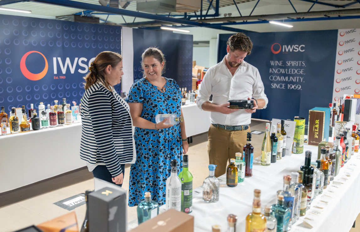
This year, our strong judging panel was formed of design and drinks industry experts - James Fleming, Creative Director at Gigantic Creative; Anne Jones, Partner & Drinks Expert, Beers, Wine and Spirits at Waitrose; as well as Sarah Miller, Spirits Writer and Founder of Gin A Ding Ding.
Entries were judged across six categories:
- Contemporary design
- Eco-friendly packaging
- Gift pack
- Limited edition
- Redesign/rebrand
- Traditional design
Discover the winners and the highly commended bottles below.
Contemporary design
This year, the Contemporary design category saw the highest number of entries, some of them – truly exceptional, as noted by our judges who admitted that it was rather challenging to identify the top performers. After a long debate, the judges selected a winner and decided to commend 5 entries which all deserve recognition.
Winner: Isle of Harris Gin, Isle of Harris Distillers
What really sets this beautiful bottle apart is that in addition to a unique label, there is a clear brand message coming across, commented our judges. "There’s restraint here – they didn’t feel like they needed to go overboard. It’s balanced, it’s contemporary, while still being elegant,” said judge James Fleming. "There are so many gins that are trying to follow the Isle of Harris way in terms of textured bottles, but without the storytelling. With Isle of Harris – there’s nothing on that bottle that doesn’t belong there,” James continued. 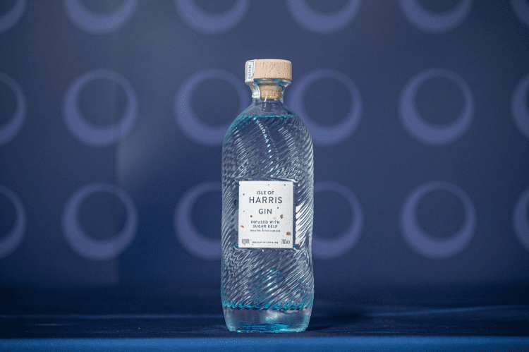
Highly Commended: Junmai Daiginjo NV, Junmai NV and Soto Junmai, Soto Sake
The judges felt that the whole range of Soto Sake products is very well executed. The design delivers a sense of heritage, yet it looks fresh and contemporary. Our experts also appreciated the diversity of the packaging.
Highly Commended: Experience N.7 Blended Scotch Whisky, Woven
This minimalistic and bold design really makes the bottle stand out. Warm colours are reminiscent of the liquid inside the bottle and the label is clean and eye-catchy.
Highly Commended: Savoia Americano Rosso NV, Casa Savoia
This beautifully textured bottle with a well-executed label is a classy example of contemporary design, said the judges.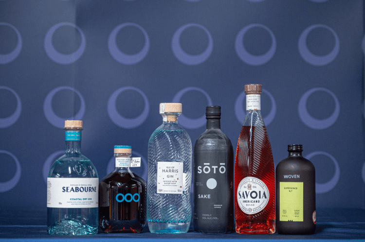
Highly Commended: Seabourne Coastal Dry Gin, Seabourne Distillery
Another great example of brand storytelling, this elegant bottle is reminiscent of the ocean – just what you would expect from a coastal dry gin!
Highly Commended: Battery Point Single Malt Whisky, Battery Point Distillery
This brave design impressed our judges who felt that the unique bottle shape and the bright clean colours will stand the test of time.
Eco-Friendly packaging
With a real diversity of entries, the judges appreciated those brands who are really trying to do something new within the category. “There is true innovation happening, particularly in spirits industry, in terms of eco-friendly packaging. They are really looking for solutions,” said judge Sarah Miller. Both the winner and the highly commended entry of this category are beautifully made and very well considered, noted the judges. As both are refillable bottles, the success of these design solutions will depend on the consumers’ response, therefore both brands deserve to be awarded for bravery, as well as for design.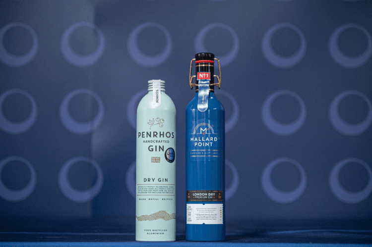
Winner: Handcrafted Gin, Penrhos Spirits
This modern-looking refillable aluminium bottle is gorgeous while being eco-friendly. It has great brand touchpoints and encourages consumers to ‘reuse, refill and recycle’.
Highly Commended: Premium London Dry Gin, Mallard Point
It is a great design on the more traditional side. The judges liked all the elements that reminded them of a steam train, as well as the beautiful secondary packaging.
Gift Pack
In this category, the judges were looking for the added value which the packaging brings to the product. “Gift pack is about how it works on the shelf, what standout it has, and whether it demands an additional price point,” explained judge Anne Jones.
Winner: Hebridean Gin and Hebridean Single Malt Scotch Whisky, Isle of Raasay Distillery
This Raasay range impressed the judges with the consistency of its gift packing, as well as with the strong, impactful brand message. Our experts loved the eye-catching vertical labels and how the fossils are mirrored on the bottles and on the boxes. “This pack really gives Raasay that lovely added value, and it has intrigue as well – you really want to learn about it, you really want to pick it up. It sets it apart. And it’s credible. The gift pack needs to tell you a grand story and that’s what it does,” said the judges.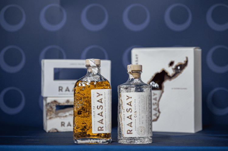
Highly Commended: Mousehall Sussex Dry Gin, Mousehall Estate
Mousehall entered the Eco-friendly category, but after a careful consideration the judges decided to highly commend it as gift pack. Our experts shared that they wouldn’t want to part with this beautiful traditional design. “The only thing I wanted to steal today was this piece of tissue paper. The design is stunning,” said judge Anne Jones. The print is exceptional - faultless and desirable for potential extensions.
Highly Commended: Kori Herbal Gin, House of Heritage Distillery
This rather unconventional gift pack impressed our judges with its clean lines, a crafty, rustic feel of the bag, its combination with the dark green of the bottle and the gorgeous pastel colours of the label.
Limited Edition
While judging this category, our experts were primarily looking for the ‘desirability’ factor. “If it makes us want to steal it, it is definitely the winner,” the judges shared.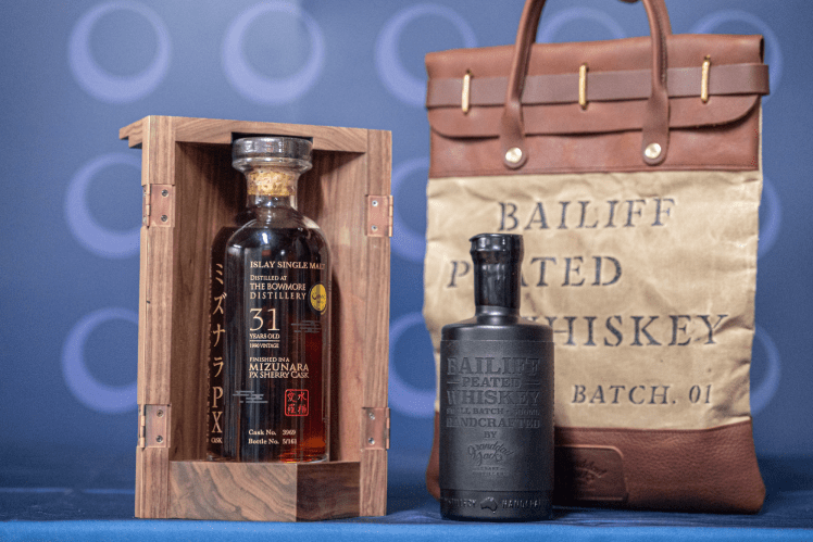
Winner: Bailiff Peated Single Malt Whiskey, Granddad Jack’s Craft Distillery
This stylish bag quickly became the judges’ favourite. Well-made, durable and unique it definitely has the desirability factor of a premium limited edition piece. “The idea is to have people fight for it, and this winner really achieves it. And it’s really well-crafted,” said judge Sarah Miller.
Highly Commended: The Bowmore Distillery 31 YO Mizunara PX Sherry Cask Finish Single Malt Scotch Whisky, East Asia Whisky Company
This well-made, traditional box is crafted using high-quality materials. Smart and beautiful details, such as etching and engraving, make it a timeless piece that really delivers a luxurious look without being overworked.
Redesign/rebrand
The challenge our judges faced with the Redesign category was that the new face of the brand had to remain recognisable. It should be evolution, and not revolution, the judges explained. Modernising the brand while still retaining its heritage is not an easy task and it takes some bravery. Not all of this year’s entries were up for the challenge, but the winner and the highly commended entries really mastered it.
Winner: Barra Atlantic Gin, Isle of Barra Distillers
Bara masterfully followed a trajectory of evolution, meaning that the consumer will easily recognise this brand in its new form. A well-executed, textured bottle is effortlessly stylish and brings up the memories of ocean waves.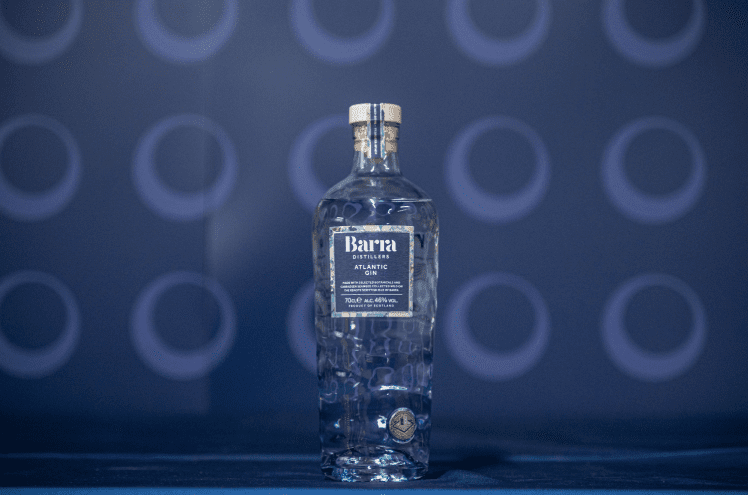
Highly Commended: Pure Single Cask Aged Rum, Ninefold Distillery
Another beautifully textured bottle, this is also a great example of evolution than redesign. This bottle will really stand out on the shelves, said the judges.
Highly Commended: Feragaia, Incharvie Group
This no-alcohol spirit brand impressed the judges with its bold, unapologetic design which really stood out in the category. The redesigned bottle features layered and abstract wild textures of where land meets sea, from a birds-eye view.
Traditional design
The traditional design category is all about those queues of familiarity, comfort and reassurance, explained the judges. There were some brilliant entries this year, although the category was mainly ruled by spirits, which our experts found surprising. “It was ironic that we didn’t see more wine in this category, wine would’ve done really well here, there are some beautiful traditional designs in wine out there. Maybe next year more wine brands should consider entering the traditional design category,” said judge Anne Jones.
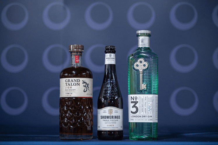
Winner: Triple Vintage, Showerings Cider Mill
This is a truly stunning bottle with a lovely sense of detail which reflect the brand heritage in a subtle, beautiful way. “It would be easy to overlook it as it is relatively quiet, but when you actually hold it, the details are lovely,” shared the judges. It is a classic design at its best and a nice nod to the wine category as well.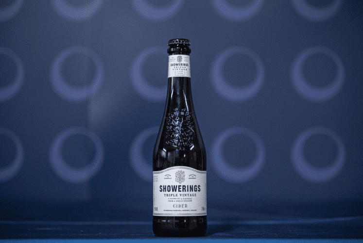
Highly Commended: Grand Talon Rice Whisky, GDMZH Pearl Red Spirits & Wines
This well-thought and well-executed example of traditional design stands out for its elegance and a sense of premium, while also reflecting the story of the brand.
Highly Commended: No.3 London Dry Gin, Berry Bros. & Rudd
The judges anonymously declared it a very strong entry admiring the classic design with beautiful colours and details taken to perfection. The “key” on the bottle is a great memorable feature that makes the product stand out on the shelves. It is an elegant and classy bottle.
