IWSC unveils the winners of the 2024 Design Awards
Following the recent judging of our 2024 Design Awards, the IWSC is thrilled to reveal the winners, as well as the designs that have been highly commended by our judges.
This year, our strong judging panel was formed of four design and drinks industry experts - James Fleming, Founder & Creative Director at Gigantic Creative, Sarah Miller, Spirits Writer & Founder of Gin A Ding Ding, Spirits Consultant Ivan Dixon, as well as Maria Blackstone, Senior Graphic Designer at Ellis Wines.
Entries were judged across seven categories, including the newly-introduced Luxury Packaging:
- Contemporary design
- Eco-friendly packaging
- Gift pack
- Limited edition
- Redesign/rebrand
- Traditional design
- Luxury packaging
Discover the winners and the highly commended bottles below.
Contemporary
The judges were impressed with the variety across the Contemporary design category, finding that they had to discuss the definition of contemporary design and find common ground on what they thought was the height of the category. They felt that the winner and two highly commended designs led the category and challenged their expectations.
Winner: Woven Hemispheres Blended Whisky
The entire panel unanimously agreed that this bottle had everything they were looking for. "It’s the whole package, with a bold dynamic approach that doesn’t simply imitate other whisky producers. The packaging is cohesive, with every little finish clearly thought through – the devil is in the details!" shared judge James Fleming.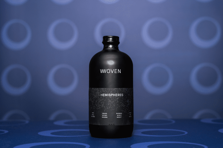
Highly Commended: CURIUS AG Match Tonic Water
The judges felt that it was refreshing to see a new approach to tonic water bottles in this entry, describing it as "eye-catching and conversation-sparking", and one judge even saying "I want them in my fridge!"
Highly Commended: Karori Drinks Company Chemistry Gin
The tactile label, with an almost molecular approach really helps this botte stand out. They judges were impressed that every part of the bottle represented the theme of the brand. "It’s uncomplicated but strikingly different and inviting," shared Ivan Dixon.
Highly Commended: InchDairnie Distillery Ryelaw Single Grain Scotch Whisky
The judges praised this entry as "the most contemporary whisky design we’ve seen, especially in terms of bottle structure which really highlights the brand story". Special attention was paid to the glass by judge Maria Blackstone who highlighted the unique texture.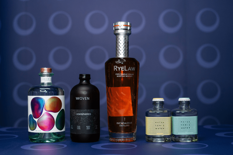
Eco-Friendly
Our panel were pleased to see a range of eco-friendly designs that incorporated sustainability without sacrificing the design. "As an industry we should embrace sustainable formats, and these choices show how sustainability can still be stylish. We are delighted to see continued innovation!"
Winner: Tread Softly Bagnums
The overall winner of this category was highlighted for it’s unique approach to the Eco-friendly category. "Alternative formats are becoming more and more popular with different bottle forms, all of which present designers with a huge challenge. The Tread Softly pouches look and feel enticing. That ties well with their whole brand, and we particularly enjoyed the novelty of the matte finish."
Highly Commended: Guerrilla Chicken Spirits Subverter Vodka
Our panel loved the reusability of this design, praising the brand for making use of a removeable label, an often overlooked detail.
Highly Commended: Castarède Cuvée des 190 Ans Bas Armagnac
"This design is a brave step to take in a highly traditional, regulated and premium spirits category. Kudos should be given to the brand for challenging convention and driving change, in the most unlikely of areas," shared Ivan Dixon who also praised the sleek execution of the design. 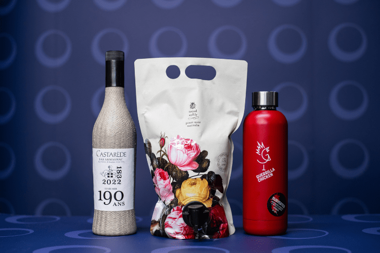
Gift Pack
There was fierce competition in the Gift Pack category this year, but the judges felt that the standard of execution across the winner and two highly commended entries set them apart. The panel also noted that all three gave an indication of where the Gift Pack category is heading with style and function working alongside each other.
Winner: Adega Camolas 5 Anos Superior NV
Judge Sarah Miller was keen to highlight the simple, yet eye-catching style of the winner of the Gift Pack category. "The design might have been simple but it caught every judge’s attention with an organic feel that was tactile, sometimes less is more!"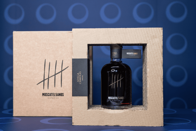
Highly Commended: Ron Santiago de Cuba 20 YO Extra Anejo Gran Reserva
This entry was praised for its "beautiful detailing on the bottle, engaging and exciting to look at and also importantly, a treat to hold."
Highly Commended: John Dewar & Sons Royal Brackla 25 YO Pedro Ximenez Sherry Cask Finish Single Malt Scotch Whisky
James Fleming admired this design, even going so far as to proclaim it "a gift pack fit for the King’s own whiskey!" While Ivan Dixon highlighted the experience of opening the pack: "Getting to the bottle itself was like unwrapping the ultimate present." 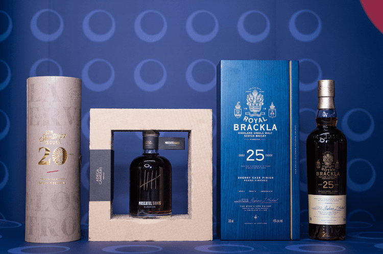
Limited Edition
Our panel was hugely impressed with the Limited Edition category: "The pieces we shortlisted were all outstanding, this is our standout category of the whole competition!"
Winner: Cask88 Imperial Distillery The Bothy 25 YO Single Malt Scotch Whisky
"This design was subtle yet captivating, imaginatively curated as something experiential and ornate, reflecting its origin and style of spirit," shared Ivan Dixon. "It was a standout piece of work, absolutely beautiful and a joy to unbox," agreed Sarah Miller.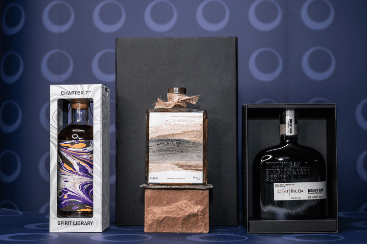
Highly Commended: Mount Gay Single Estate Series
The judges felt that the understated yet compelling style of this design clearly highlights the premium, luxury nature through every aspect.
Highly Commended: Chapter 7 Whisky Spirit Library 1993 Cuban Rum
Our panel enjoyed the vibrancy and loudness of this design, calling it "bold and brave, tasteful and attractive".
Redesign/Rebrand
This was a divisive category for the judges, who felt that the difference between evolution and revolution was clearly on show through the entries. "We were looking for rebrands that really changed everything, which the three brands we highlighted have certainly done. With their resdesigns they have managed to keep up with the market and trends to stay relevant," shared our panel.
Winner: Holyrood Distillery Height of Arrows Gin
This "bespoke, tactile design with a distinctive bottle shape" was chosen because the judges felt it showed a complete transformation from previous iterations. Judge Maria Blackstone also highlighted the improvement in storytelling through the details on the bottle. 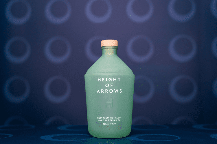
Highly Commended: Churchill’s Grafite Branco, Late Bottled Vintage Port, 30 Year Old Tawny NV & Reserve – full range commended
The full range of Churchill bottles were commended by the judges. "This bold, brilliantly executed refresh of a prestigious brand is really impressive. It’s so much harder to rebrand such a well-known company but Churchill’s have managed to refresh and create the designs relevant for a modern consumer," said the judges.
Highly Commended: Sky Wave Gin New Branding and Packaging
Our panel drew attention to the "complete and utter transformation" of this brand, commending the way the rebrand stands out and gives the brand a clear identity.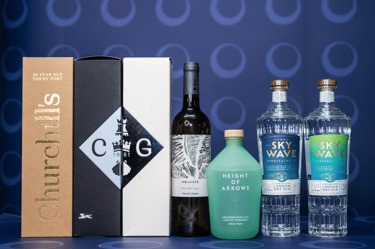
Traditional
Our judges found the Traditional category a challenge to judge. "With so much variation, we were looking for comfort and reassurance with each detail of the product, but key, without feeling old fashioned!"
Winner: Martell & Co Single Cru Small Batch XO Cognac
The winner of the Traditional category wowed our judges with the clever use of story telling through small details that didn’t sacrifice tradition. James Fleming shared that it was a "really iconic and fitting example of a brand with such a storied history, executed to the highest standard while still being a classic!"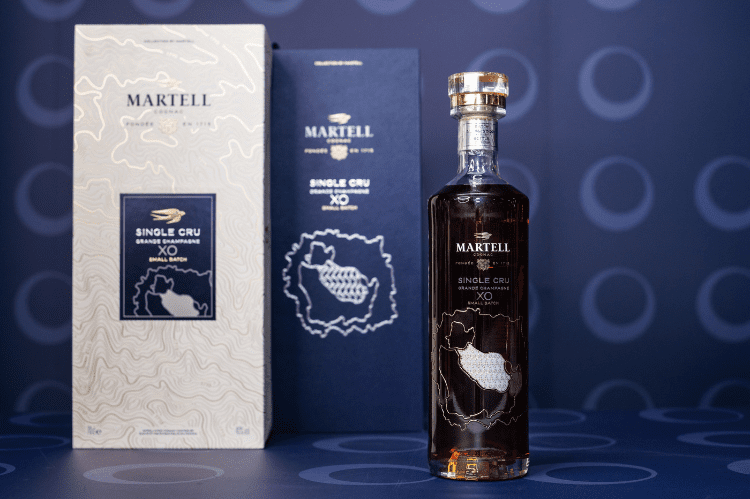
Highly Commended: West Cork Distillers Maritime Release Sherry Cask Finish Irish Single Malt Whiskey
The use of a traditional blown glass bottle style really stood out to the judges who all felt that it was appealing without taking itself too seriously. 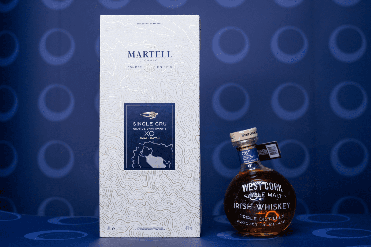
Luxury Packaging
New to the 2024 Design Awards, this was an exciting category to judge. Maria Blackstone explained: "As a designer you work to make products desirable. With this category the designs needs to be so desirable the judges should be fighting over the winner! Is the experience of unboxing and opening it as memorable as the product inside? With luxury products like these the design needs to match and add to the value of what’s inside and the two choices we made definitely do that."
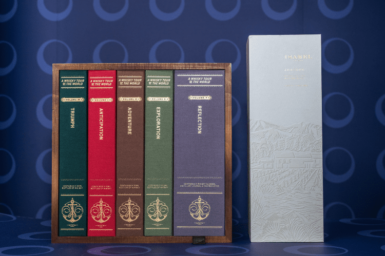
Winner: Gravity Drinks Ltd A Whisky Tour Of The World
The judges were blown away with this entry. "This product gives the recipient an unrivalled experience of whiskeys around the world, with fantastic producers in a library format that is just so pleasing to unwrap and explore," said Sarah Miller.
"What an amazing idea brought to life impeccably! An incredible experience for anyone that receives that will last long in memory as something completely unique and transcendent," agreed Ivan Dixon.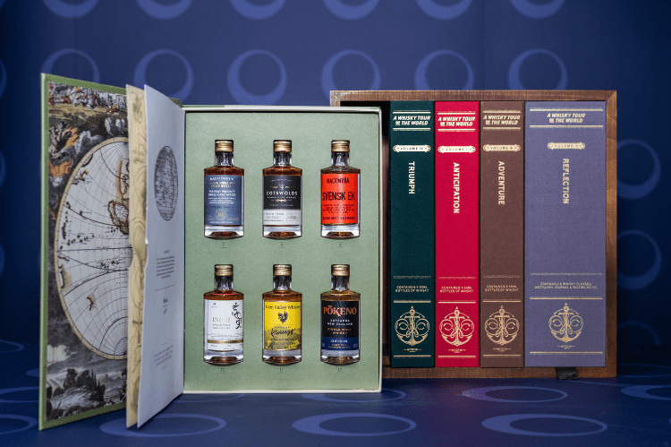
Highly Commended: Isabel Estate Aratoro
The panel felt this understated yet beautiful design was indulgent and special: "Anyone would be delighted to receive this as a gift!"